Simex Website

Thirty-five years of keeping freight on schedule. The new site finally runs on the same schedule.
A long-term partnership that started with a new visual identity for the company’s 35th anniversary and grew into a website built to carry that identity and keep up with the business behind it.
What we did:
Brand Identity · UI/UX Design · Custom WordPress Development
What we achieved:
one unified identity across brand and product · full content control handed back to the Simex team · multilingual, dark/light platform built to scale

The Reality
A reputation established over decades, carried by a website built for one moment in time.
Founded in Novi Sad, Serbia in 1990, Simex has spent almost four decades building its name in freight forwarding, international transport, and customs representation. Today, the company operates across Europe, working with everyone from SMEs to international corporations, helping each one navigate its own logistics challenges through long-term partnerships and consistent, reliable delivery.
The brand and the website carrying that reputation hadn’t grown at the same pace. The visual identity predated the company’s current scale, and the website organised information in a way that made sense years earlier but now slows everyone down. Internally, the team faced administrative bottlenecks because every routine content update required a developer instead of a quick edit.
The Shift
We stopped designing pages and started routing information, just as Simex does when it solves cargo issues every day.
We synchronised the identity redesign and digital product engineering into a single, continuous workflow, knowing that a modern website requires a visual identity that fits the company’s current scale.
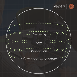
During our discovery workshops, we saw that modernising the aesthetics alone wouldn’t solve the underlying problem; we needed to rebuild the entire information architecture.
Three principles carried the work from there:
- Reduce the distance between what a corporate partner is looking for and where the data lives.
- Simplify navigation across services and content types.
- Build a structure that scales without adding complexity.
So the work moved in sequence: first a basic visual identity package built to mark the company’s 35th anniversary, then a website designed and built on top of that new identity and a clearer information structure.
Once the structure was right, everything else got easier.
The Build
Two layers of identity, built to work as one system
Brand & Identity
Through team workshops, iterative logo sketching, and systematic refinement, we developed a new logo, colour palette, and typography system, then extended it across print materials: office signage, email signatures, sales decks, and corporate documents.
UI/UX Design
We designed the interface in Figma, building on the new identity and on a clearer information hierarchy. The process: research and competitor analysis, information architecture definition, wireframing, high-fidelity design, repetitive refinement, and preparation for development.
The result improves readability, navigation, and access to service information across all devices. The interface features a custom dark-and-light mode toggle, multi-language support, and full responsiveness across all devices.
Development
The Figma file became a custom WordPress theme, built specifically around Simex‘s needs rather than a template: fully responsive across desktop and mobile, tested across browsers, with a CMS structure designed for both stability and prospective scaling.
Build phases: desktop and mobile coding, internal testing and UX refinement, then deployment to the client’s own server.
Clean Under the Hood
The part that matters most to a client like Simex doesn’t appear in a screenshot: a system of reusable content blocks. This system gives the Simex team full control to publish new pages, update existing sections, and manage layout variations independently, without relying on a developer for day-to-day work.
A company that runs its own fleet doesn’t need a third party to move a sentence from one page to another.
Impact
A record of decades of quality, brought into in-house control.
The visual identity gave Simex a clear, modern, and powerful brand presence; a quality that, as the team put it, is always the easiest thing to remember.
The new website reflects Simex‘s real scale and improves service visibility for SMEs and international partners. Most importantly, content management is now fast and flexible, empowering the Simex team to make updates and launch new pages in-house, improving productivity and responsiveness.
The Reality Check
The system clarified our design and development pathway.
At the start, the assumption was that the main challenge would be visual modernisation: a new look, a sharper logo, a cleaner site. Once research was underway, we realised the real issue sat one layer beneath that: how information was structured and how people actually moved through it. Once that framework was clarified, the design and development decisions that followed became far more straightforward.
That clarity also showed up in how the project ran. From the start, brand and product were treated as one decision rather than two, which meant our conversations focused on execution rather than persuasion.
The work moved at the pace of the thinking behind it, which, for a company that gets cargo across Europe on schedule, felt like familiar territory.
Foundations make it easier to ship every feature you add afterwards. Struggling to connect strategy and execution? Let's talk.
Latest Projects