Axceler8 Solutions

Design as a Catalyst for Corporate Synergy
How we created a unified digital identity for a high-stakes Joint Venture, bridging the gap between strategic legacy and engineering excellence.
What we did
Enterprise Brand Strategy · Brand Architecture · Naming System · UI/UX · Webflow Prototyping & Dev Handoff
What we achieved
Accelerated Market Entry · Secured full alignment among all C-level executives · Scalable Brand System for Fortune 500 Expansion
The Reality: The Complexity of Shared Ambition
When two global leaders build one vision, the challenge is alignment at scale.
We partnered with 135-year-old strategic consulting powerhouse Arthur D. Little and the global IT engineering leader Vega IT to launch Axceler8 Solutions, a 50/50 joint venture focused on developing AI-driven solutions for efficiency and process automation.
The goal was to launch a new entity focused on AI-driven efficiency. However, with multiple C-suite stakeholders from different corporate cultures, the project faced a “translation” gap. The brand needed to reflect two distinct legacies while projecting a singular, future-oriented authority to the Fortune 500 market.
The Shift
The brief was ambitious: a name that signals speed, precision, and technological edge – without sounding like every other AI company launched in the last three years.
So, we stopped looking for a name. We started looking for what the name should do.
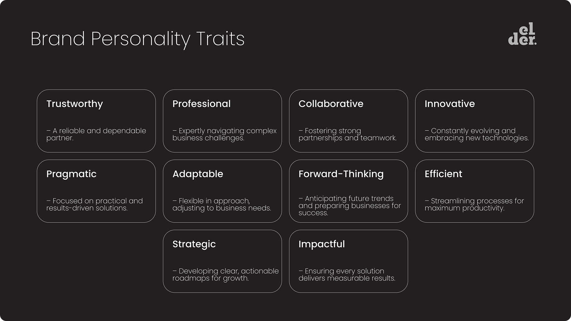
The workshops were conducted entirely in Miro, in a fully remote setup. Four stakeholders, four perspectives, one shared whiteboard. We mapped values, personality traits, and emotional responses. We asked: If this company could introduce itself in one sentence, what would it say?
So, we stopped looking for a compromise as well. We started building a framework.
What emerged was not only a name – it was a logic.
- Speed – as a core value
- Acceleration – as a promise
- Precision – as a differentiator
The alphanumeric structure wasn’t a stylistic choice. It was a signal: this company operates at the intersection of human strategy and machine precision.
This one was a bit different – we played around with a Webflow prototype for fun, but it turned out to be a real time-saver and solid starting point for the development team.
Three principles drove every decision that followed:
- Future-forward naming – A modular naming system designed for product expansion across industries, without breaking brand coherence.
- System before aesthetics – The visual identity had to function as infrastructure, not decoration. Modular, scalable, developer-friendly.
- Invisible brand elements first – values, personality, tone, suffix naming logic. Visible assets come after the solid foundation.
The Build: Engineering the Brand System
Naming
From the workshops, we developed a shortlist with full rationale behind each proposal, because a name without a story is just a word. The client voted. The logic held. Axceler8 was born with a naming system that allows sub-brands and product lines to extend naturally without losing coherence.
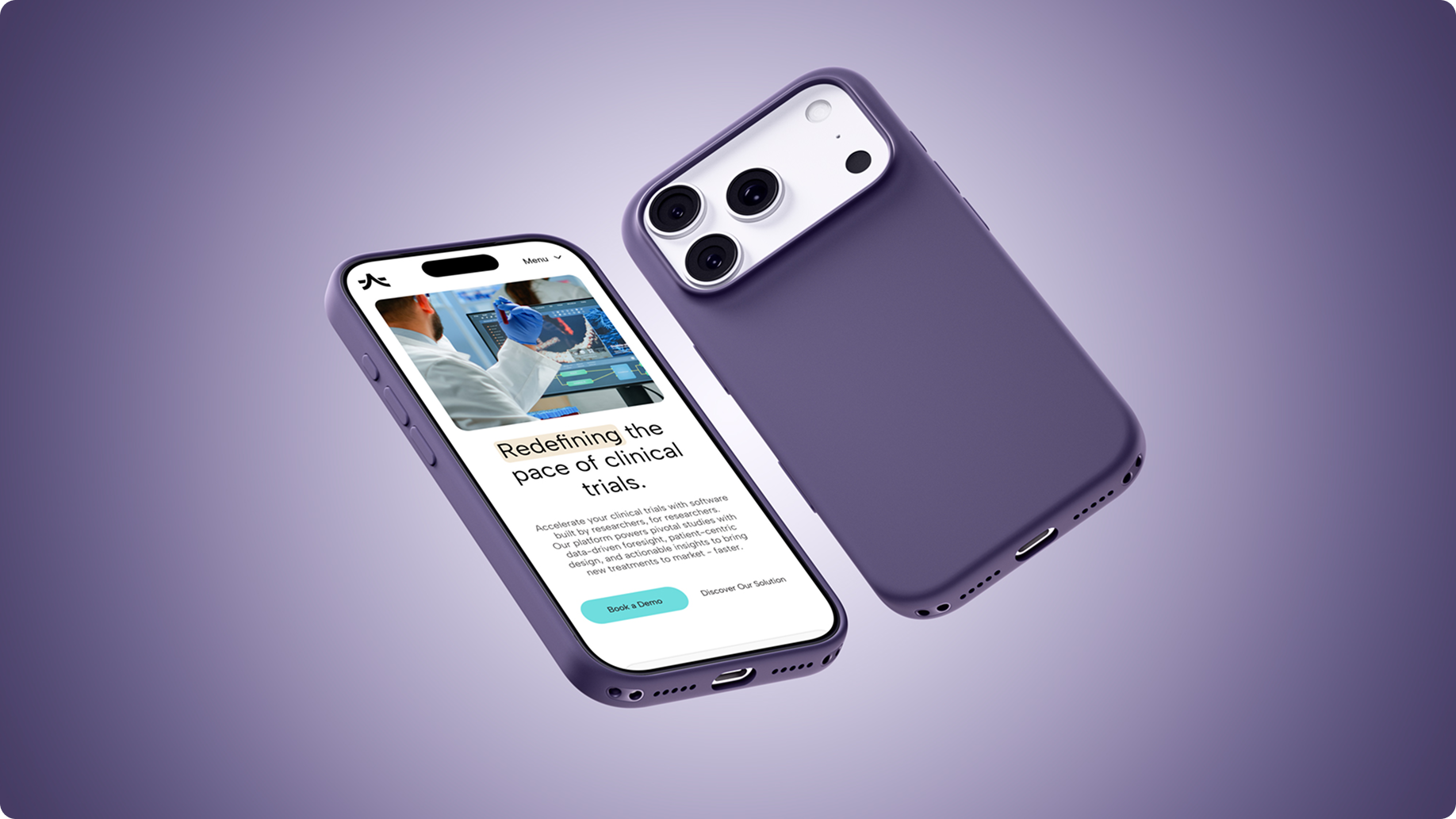
The first application: Axceler8 Rx. A platform for accelerating clinical trials, already deployed in 30+ global studies across oncology, neurology, and cardiovascular therapy areas.
Visual Identity
Logo, color palette, typography, iconography – all developed across four phases:
- moodboards,
- selection workshop,
- logo proposals,
- final brand styleguide.
The client chose at each stage. Nothing was imposed.
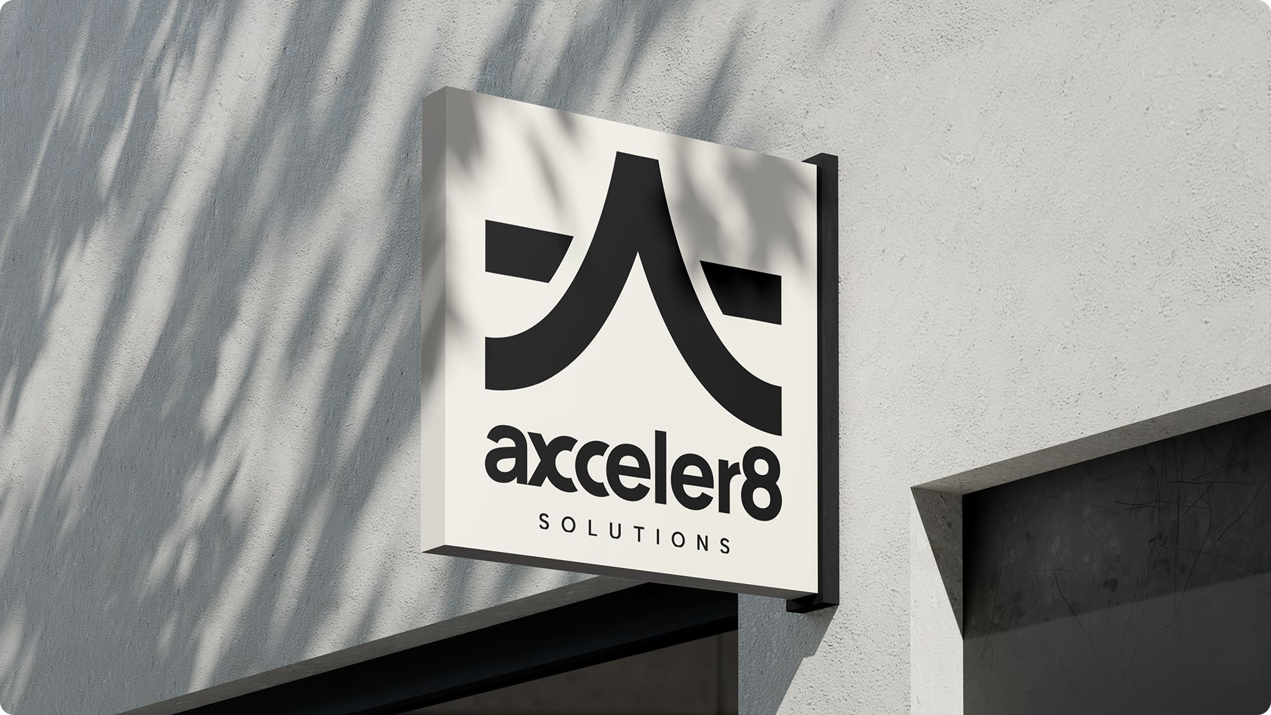
The visual language communicates what the name promises: clarity, precision, forward motion. No decorative elements that don’t earn their place.
Tools: Adobe Illustrator, Adobe Photoshop, Adobe After Effects, Figma.
Website
The website does two things well:
it tells the brand story without overexplaining it, and
it stays out of the way of future growth.
The architecture is modular, developers can extend and update independently, without requiring a designer for every new section. This was a deliberate choice, not a technical afterthought.
We prototyped in Webflow before handing off to development. What started as an experiment saved significant time and gave the development team a working reference point from day one.
Companies that treat branding as a visual layer create noise. Companies that treat branding as infrastructure build ones that last.
Impact: Time to Market Compressed
The custom-built website tells the brand story with clarity, sophistication, and functionality, allowing Axceler8 to showcase its innovative capabilities and thought leadership.
One of the first applications of this identity was Axceler8 Rx, the platform shaping the future of clinical trials. Already attracting the attention of a global Fortune 500 biopharmaceutical company, the platform’s next phase focuses on integration with existing clinical trial management systems to streamline operations and improve data accessibility.
Fortune 500 Traction
The platform immediately engaged a global biopharmaceutical leader, proving the brand’s institutional authority
Operational Velocity
By implementing a “design-to-dev” modular system, we saved the technical team hundreds of hours in front-end alignment.
Market Readiness
Market Readiness
Axceler8 launched with:
Clear positioning
Scalable architecture
Strong executive alignment
eliminating typical post-launch friction.
The Reality Check
Four stakeholders with four different aesthetic preferences will find a way to disagree on color. That’s expected. What we didn’t expect was that the real alignment challenge was linguistic: the two founding companies used different vocabulary to describe the same things. Strategy meant something different to Arthur D. Little than it did to Vega IT. Innovation meant something different, too.
So, before we could name the brand, we had to build a shared language between two organizations that had worked together successfully for a year but had never had to sound like one. Once we had the shared language, the name followed quickly.
Through design-led strategy, we ensured that the platform’s digital experience reflects its innovation, reliability, and industry-leading expertise.
This holistic, design-led approach positioned the brand to engage its audience confidently, consistently, and globally — ready to grow, inspire, and lead in its category.
You don't need more features. You need a foundation. Struggling to connect strategy and execution? Let's talk.
Latest Projects